Have you ever entered someone’s Figma file and spent hours and hours figuring out what’s what? Is design handoff a grueling and time-consuming task for you as a designer? In this post, you’ll find tips, tricks, guidelines, and useful links to help you navigate these and many other problems designers and developers face during the design handoff.
This guide is rather comprehensive, so feel free to skip to the chapters that interest you most.
- What is a design handoff?
- How to do a proper design handoff?
- Proper organization of your Figma file — with examples
- Design handoff in an Agile environment
- Summary
What is a design handoff?
First things first. Defining the issue.
Design handoff is the process of transferring the final design from the design team to the development team. This typically involves providing the development team with all of the necessary design assets, such as wireframes, mockups, style guides, and any other relevant documentation. The design handoff process is an important part of the design process, as it ensures that the design is properly understood and implemented by the development team.
Why do we design handoffs?
- To make it easy for developers to develop the product accurately, as designers intended
- To make sure our design is consistent.
- To make it easy for developers to estimate their project
- To make sure the developed product is consistent with our design
Why do designers commonly ignore handoffs?
The most common mistake designers make during the handoff is that we don’t provide enough context and documentation. It’s an easy mistake to make if you’re focused only on your design and an even easier mistake to make if you’re in a time pickle. So what designers usually do is, they just hand off the completed screens in their Figma file and that’s it. I’m here to remind you the screens are not enough.
Imagine you are building a house and the only reference you are giving the builders of your house is a visualization of the interior design. No floor plans, no installation plans, just a beautiful picture. The builders would have a million questions: where is the floorplan, what are the dimensions, what to do with the pipes, where to install electric cables,… (although let’s face it, most of them will just think you’re just completely crazy or that you’re fooling around. Some of them might even be impolite to you!).
The same thing happens if you just give over your finished design screens to developers. Without proper documentation, they can’t build the product you designed. Therefore it’s important to organize your file in a systematic way, add notes with descriptions and arrows explaining the connection between the screens, prototypes, and so on. How to do this properly? Well, just read on.
How to do a proper design handoff?
Follow our design process
We have a carefully planned and systematic approach to design which is explained in our Confluence (note: only visible to Qumans). Following these guidelines will make it easier for you to hand off your designs because you will have all the deliverables and pre-requirements ready to go once you finish designing.
Pre-requirements for design handoff:
- Finished and approved UI
- All assets (copy, images, icons, typefaces, etc.)
Deliverables for design handoff:
- Information architecture
- User flow diagram
- Mockup
- Prototype
- Styleguide
- Typography scales
- Prepared and cleaned assets (copy, images, icons, typefaces, etc.)
- Breakpoints
- Transitions and (micro)animations definitions
The devil is in the details — pro tips for having clean design files and assets
- Fixed width elements — When elements have a fixed width that should be indicated to developers (add a description for a module). A perfect example of such an element would be a pop-up module.
- About page in Figma — It’s good practice to create a separate Figma page with links to project documentation and the responsible person’s contact info. Here is an example of a template we use.

- Changelog — when working on larger projects, or on projects with many iterations, it’s a good idea to create a changelog and update it regularly.
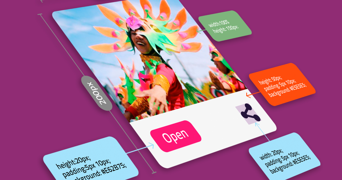
- Max characters — when the space is limited, we should document how many characters is the maximum. If you know that paragraphs would have a maximum number of characters or lines of text on different breakpoints, please put that information into the design. A perfect example would be blog article cards. If you want to have a maximum of two lines of text on the article card on a desktop, and three lines of text on mobile screens, please write that down for developers. In this case, this information can be put as a placeholder, instead, or in addition to lorem ipsum text.
- Designer’s notes — to make your screen clear to read for developers, add a note next to it. Be concise and informative. Try to think from the perspective of a person who is seeing your screen for the first time and write additional info you think might benefit them. Some good examples are prerequisites, micro-animation notes, element fixed width… Write down anything that is not clear or visible on the screen at a first glance

- Screen headers — for additional clarity, we add screen headers above the designed screens, with a short description of the user flow these screens depict. It is also useful to provide links to any additional resources or even Jira tickets here.

- Linking screens with arrows to show the user flow — this way its easy to see how the screens are connected to each other, which brings clarity to developers and really helps when onboarding new designers on the project.
- For Quman designers who want to “do more”, here is a link to our Figma file which explains the musts, the should haves, and the nice to haves of every design project.
Use atomic, modular design
A modular design is an approach to product designing which we use to produce a complete product by integrating or combining smaller parts that are independent of each other. With the modular design approach, a complex product (for example, a car) can be broken down or divided into smaller and simpler components that are independently designed and manufactured. Each of these components is then integrated (or assembled) to form the final product. The same logic is applied to software engineering and design.
Per the basic definition, modular design allows one to customize, reuse, upgrade, or maintain product designs. Additionally, the modular product’s independent parts follow a standard interface to fit into each other as the finished product easily.
Atomic design is a design principle that divides the design into small parts called modules. Atoms, molecules, organisms. Learn more about atomic design here.

Use our library of reusable components to speed up your work and make it more consistent.
Showcase your components on a separate page so the developers have an easy overview of the modules they need to build.
Always use auto-layout
I cannot stress how important this is, yet not every designer is comfortable with it. The reason behind is that auto-layout (if properly used) mimics the way the frontend elements behave in CSS flex, which is the industry standard for creating front-end layouts. No elements should be left “hanging in the air” because it’s not the way these elements behave once developed (they would have been positioned absolutely which is an uncommon practice).

Designing in auto-layout means thinking like a developer during design, and that’s challenging for designers who are unsure how front-end code works. However, if you want to step up your game as a designer, designing with auto-layout should become second nature to you. Learning how layouts work in CSS (flex, grid, positioning, etc) will help you a lot in developing the ability to think like a developer, and become a better UX/UI designer.
Here are links to some resources I found helpful:
Auto layout in Figma
CSS Flex
Using spacers
Spacers are basic components that contain empty space. There are two reasons why I use spacers. Firstly, instead of manually adjusting paddings for each layer and each container in the auto-layout, you can just leave it at 0 (zero) and use spacers instead. Secondly, developers usually don’t have edit rights for our Figma file, so it’s harder for them to see the paddings of each layer and component, whereas with the spacers they don’t have to click and inspect every layer. Make the job easier for your developers, they’ll love you for it.

Proper organization of your Figma file — with examples
Let’s have a sneak peek into a Q internal project Figma file organization. Note this is not the only way to structure your Figma file, but the logic behind it should be very instructional, especially to designers who haven’t worked in an agency environment before.
Before any design even happens, designers are provided with documentation (usually by the BA team) that includes app features divided into epics and user stories as well as sets of rules and prerequisites for each feature. This is a nice example of such a sheet:

What we’re doing in Figma is actually visually representing this spreadsheet so it makes sense to follow the existing documentation format in our Figma file as well. This will bring clarity to everyone involved in the project.
Here’s a guiding principle on how to organize your Figma file to mimic the given documentation:
- For each epic, create a separate Figma page. Name it same way as the epic in the docs. For me, this would be E01 – Account administration
- Group all screens for each user story into a separate section. This is a relatively new feature, and a neat way to keep your frames organized. (keyboard shortcut is: Shift+C) I named my first section 01-Profile page layout
- Organize and name the screens in each section properly, i.e. 1920 – 01 – 1 Page Layout
- 1920 stands for dimensions (desktop), 01 is the number of the user story in this epic, and additional numbers are steps in the flow.
- Screens next to each other show the same view, but on different viewports/breakpoints (desktop, tablet, mobile)
- The screens below follow a logical user flow (in which preconditions for the next screens are clearly visually represented) or show edge cases that need further explanation.
- Don’t forget to add notes for descriptions and additional explanations

Design handoff in an Agile environment
It’s worth noticing that design handoff, as a single, final phase of the design process is a part of a waterfall methodology which is somewhat outdated in favor of Agile methodology.
In an Agile environment, it’s even more important to continuously follow the design process because the handoff happens literally every day, only in smaller chunks. You will be a part of daily scrum ceremonies and you will need to collaborate closely with developers and business analysts to deliver every sprint.
Tips to improve your communication with the developers
Ask constructive questions frequently
What library will you be using? Is this screen clear to you? Do you have any questions or suggestions? These are examples of such constructive questions. For instance, if you know the developer will be using the Bootstrap library it would make sense to design your screens to match Bootstrap layouts and breakpoints.What you shouldn’t do is let developers dictate your designs. If you designed a certain feature in a way you think it’s best for the users, don’t let the developers persuade you otherwise just because it requires some extra effort on their part. So, ask them questions, value their opinion, but push your solutions when necessary.
Be clear and concise in explaining your ideas. Avoid technical jargon and ambiguous abbreviations
Never assume the developers will understand your technical terms, such as kerning, bleed, above-the-fold, etc. Most of them will understand you, and that’s great, but it’s not in their job description to do so. The same goes both ways. Developers, please, we’re already struggling even without trying to decipher what MR, PR, MVP, DB, UAT, or API mean… 🙂
Be flexible and adjust to your project and your team’s workflow
In Agile, you need to be flexible because you’re constantly working closely with your team. What I like to do when I start working on a project is schedule a meeting with my project team members (usually it’s a BA and front-end devs). Together, we go through the broad business requirements, and then we organize our Figma file in a way that best suits our workflow. For example, on one of my recent projects, the product owner would often open new Jira tickets in which he would ask for various proposals, even after the a certain idea got its approval.
Therefore, it made sense to create a Figma page just for Proposals that needed to be approved. That page had sections with links leading to specific Jira tickets. It’s not our standard practice, but it worked best for us in this particular case. This kind of flexibility is typical for an Agile environment. It’s expected of us to adjust and adapt.
Live Q feedback culture
You shouldn’t be afraid of giving and receiving feedback, provided it’s constructive. We all make mistakes, but we also learn from them. If we’re not aware of our mistakes we can’t learn, it’s as simple as that. So pointing out mistakes and accepting our mistakes leads to the team’s growth. But remember our values, be kind.
Is Agile better?
Overall, design handoff in Agile is much easier, because the communication between the designers and developers is much more frequent, and the amount of documentation designers need to prepare is considerably less. However, in Agile it’s even more critical to set up your file properly from the start and to update it regularly.
Summary
Design handoff should not be a source of stress for you if you think about development from the beginning. Structure the file neatly, according to our guidelines. Let your design match the development process as much as possible by using atomic design, grids, spacers, and auto-layout. Be consistent with naming conventions. Document and label everything, and don’t forget to communicate as much as possible with your developers.
Give Kudos by sharing the post!
ABOUT AUTHOR

Hrvoje Miloloza
UI/UX Designer
