October 8, 2020 - 7 min
Let’s talk about Design Systems

Design systems have become a big part of everyday work in the IT industry. Today, digital products are very complex and used on multiple platforms. Time is money – and that time includes countless team meetings, onboarding of new employees, introducing your product. We need to make those products consistent and recognizable. To increase eiciency in your workflow and save time developing a product, your projects require a stable library of components. We’re not talking just about building a system of design deliverables, but also about maintaining it and keeping it updated with the latest changes and implementation versions.
It’s not a job for one person, but for a whole team working on a project: designers, developers, and executives. The design system isn’t just a Sketch library or style guide. It’s all of that and much more.
What exactly is a Design System?
Let’s put it this way – a designer creates a website or an app and delivers all of the necessary assets to the developer, along with a style guide that explains how to apply each design component. Then, we have a developer who turns those design components into code. As of that moment, you have 3 categories of the product development process:
- Assets
- Guides
- Code

Create a system that contains all 3 categories and you got yourself a Design System. In other words, a Design System is not a deliverable asset or a guide, but a set of design deliverables and reusable code snippets. We’re constantly upgrading it as it evolves with the product for which it has been built in the first place.
Why do you need it?
Implementing a design system in your company’s product workflow brings a variety of benefits:
- Eiciency. By organizing design elements into components, design systems make the whole process more eicient, like planning, designing, testing, and coding – these processes are all streamlined to reduce wasting time.
- Easier onboarding of new team members.
- Design and code once. Your design system components will ensure all your products use only the UX elements your customers prefer. And you never have to design or code the same thing twice.
- Better internal communication. As a standardized document, design systems minimize the amount of miscommunication, acting as the sole source of truth for both design and code standards. They keep everyone on the same page to avoid confusion.
- Consistency is key. All of the components and UX elements will follow the same established rules from the start. There’s no need to reinvent the wheel, and your products will become stronger brand ambassadors by oering a consistent experience to your users across dierent touchpoints.
- Updating. Update it once and it populates all occurrences. Updating the same bug on dierent products can get annoying, not to mention time-consuming.
What does it contain?
The design system will contain all the deliverables from design and code, as well as the usage guidelines for your digital product. They are always up-to-date, ready to be used for building a product and maintaining it.
It includes all of the elements and a framework that helps create consistent UX across all platforms your product uses. It provides product owners and design/development teams with complete and explicit guidelines on how to build consistent products. From atoms to organisms and pages to templates.

How to start with design systems?

On your way to creating a better process, start with the basics – consider the following signals to guide your decisions and check if a design system would be beneficial to you:
- You’re building the same things over and over. Designers are asking the same questions. You have dierent types of designed components in your digital product.
- You have a multi-channel product, and your users don’t have a consistent experience across the board.
- You’re growing fast and need to be able to design with a common language and consistent aesthetic that upholds your company’s brand.
- You want to speed up your process of developing and maintaining your product and use less time figuring out which button to use and where.
- Design is separate from development, so you don’t often talk about building or sharing components. You typically just build out one-o features.
- Your seasoned designers understand accessibility, but new designers have to learn it from scratch. Imagine if that knowledge was transferable to the next hire, as easily as sharing a step-by-step guide.
- It takes months to onboard your new developers, designers, and product managers, and it takes even longer for them to comprehend your design language.
- You’d like to be able to test your solutions and learn faster, but you often run into time constraints. You’re forcing your engineers to simply build what you design and move on to the next issue.
Defining your company’s design system can revolutionize and streamline the way your team works, and the best way to get started is by looking at other teams’ successful systems. Then, it’s up to you to iterate it according to your brand’s guidelines and product styles.

Design system stages
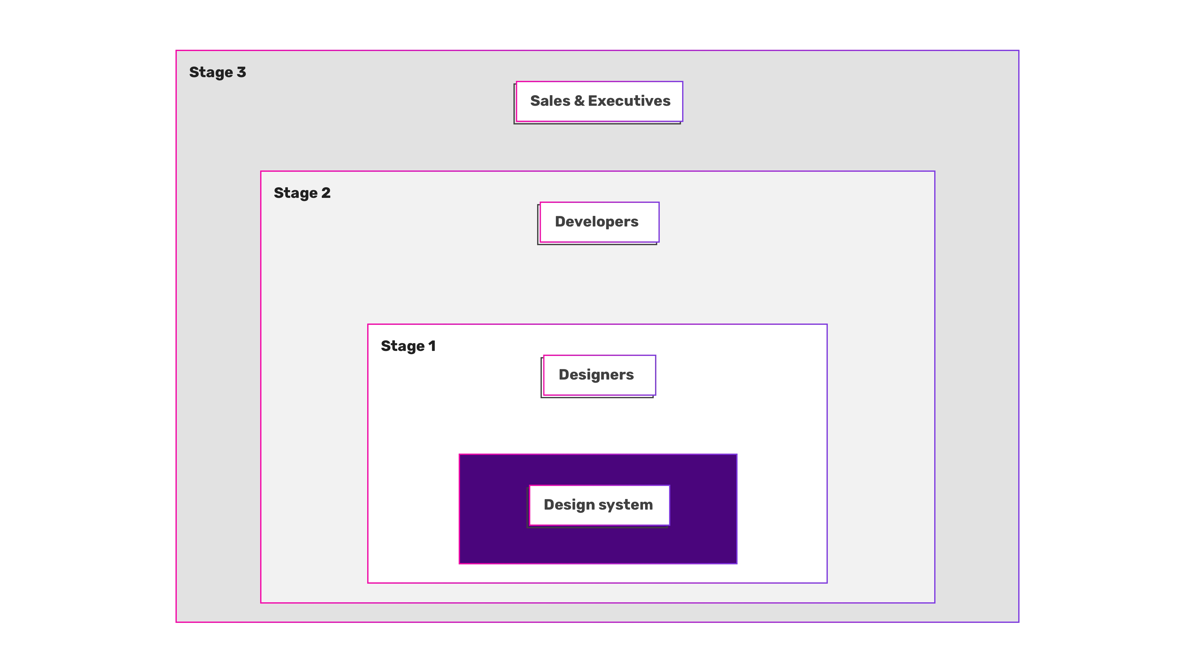
When starting with a design system, we’re preferring it to be processed in stages configured for a specific audience. Each stage comes with its advantages. Your team of designers lies in the middle of the system – creating the foundation of your system and constantly iterating based on the continued feedback from the users.

For larger companies with separated design teams (branding, marketing, product, etc) it’s mandatory that they are all included in the process of creating a design system foundation before you start implementing the design system in code. There are several significant advantages to onboarding all of the design teams to your design system first, before development begins. Doing so gets the teams involved and gives them ownership of the system at its start. It’s much easier to encourage adoption when it’s something you built together.
If your design system feels imposed, unifying is a messy, slow process, requiring refactors, breaking changes, and hard conversations. In our experience, if everyone had ownership from the beginning, it would have been a much easier process than fostered a healthy relationship from the start. Making this eort first also results in external marketing that’s much more consistent.
Stage 1: Designers
The first group behind your design system is the product designers. From there, it should expand to include either the remaining design teams within the company or product development teams. The size and organizational structure of your company will determine which you pursue first.
The accompanying design documentation encourages knowledge sharing, reduces the need to ask questions, and helps eliminate design setbacks. When we share the same resources, methodologies, and philosophies as a unified design language, we can get into the design problems without worrying about things like tribal knowledge, brand identity, pushing pixels, and a whole lot more.
A new designer or developer instantly feels more connected with the company, the product, and its people, when they can:
- Browse the list of available components,
- Quickly access their usage and content guidelines,
- Retrieve information about design best practices, color guidelines,
- Research methodologies.
While it’s helpful for your design teams to collaborate and have their use cases represented in your design system, be mindful of becoming too prescriptive with the teams joining the party later on. For example, you don’t want to force some product-based components into your marketing designs if they don’t feel right.
Stage 2: Developers
The next segment is introducing developers and project/product managers. By this point, design technology should be an important part of your organization, to simplify your designers’ workflows and to make it easy for development teams to uptake your design system. As part of your design technology eorts, your team should be ready to create, control, and maintain codified versions of the visual primitives that make up the building blocks of your design system for developers. This includes tokens like colors, icons, typography, and simple components like buttons, inputs, and menus.
Providing these resources, along with your design system’s documentation, empowers product managers and developers to hit the ground running, creating consistent experiences that follow your product voice, UI standards, and component guidelines. With this as a baseline, it also makes design reviews much smoother. Your documentation will serve as a constant reference for developers so they don’t need to query designers as much. This increases eiciency and ensures that the product teams are using the right components for the right use cases. This is the easiest way to broaden the audience of your design system and design language.
Stage 3: Sales & Executives
For now, the only users for your design system have been the people creating your product. What happens if you want your entire company to approach their daily problems with good design in mind? What about equipping salespeople with the information and resources necessary to make a sell.
This is when you want to include the remainder of employees who haven’t yet directly experienced the benefits of your design system. Give presentations to varied teams across your company. You can cover the fundamentals, philosophy, and resources provided by your design system, presenting them in a way that can be converted into strong selling points. The main goal during this stage is to encourage the realization of the value, purpose, and potential that your design system brings to your company.
Conclusion
While the aforementioned stages of rolling out a design system are ideal, they are not necessary to look at as “rules”. You may find yourself naturally starting a specific stage later in the process, or creating new stages as you go along. They are simply a way to conceptualize the dierent audiences and a suggestion of the rough order in which they should be introduced to your design system. Each stage should be an ongoing process, constantly upgraded and improved, as you scale your design system to your audience.
Breaking our milestones into stages like this is helping us progress. Regardless of how large your company is, the key is to break up the rollout of your design system into smaller, easily achievable finish lines.
Give Kudos by sharing the post!


